Open source tools for research

Breve

Breve

2015 – ongoing
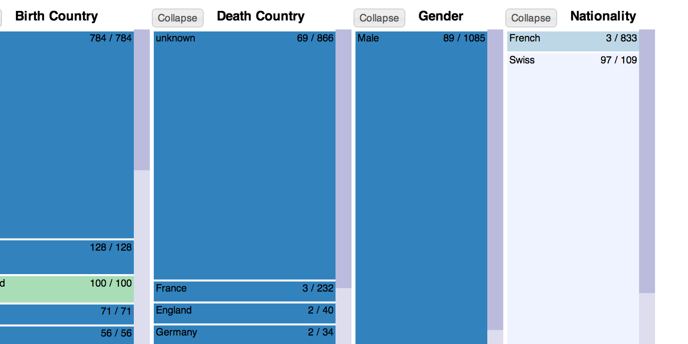
Breve is a meta-visualization for tables with editing built in. Tabular data can be difficult to read. Breve reveals mis-matched values, datatypes, and missing values at a glance.
Demo App Code

Palladio

Palladio

2014 – ongoing
A visualization platform currently under development (funded by NEH) with an emphasis on data refining and linking combines a map view, node-Link graph view, and multiple filters. Visit hdlab.stanford.edu/palladio-app/ to learn more about the project.
Demo | App | Code

Interactive Visualizations & Experiments

Grand Tour Timechart

Grand Tour Timechart

2015
An experiment in viewing estimated duration cummulatively.

Idiographic

Idiographic

2014
An experiment in creating and editing graph data through a visual interface.
Demo |--> Code

Shuffle

Shuffle

2013
A multi-dimensional facet-filter tool based on Elastic Lists, combined with a timeline and gallery display of results.
Demo-->
Knot

Knot

2012
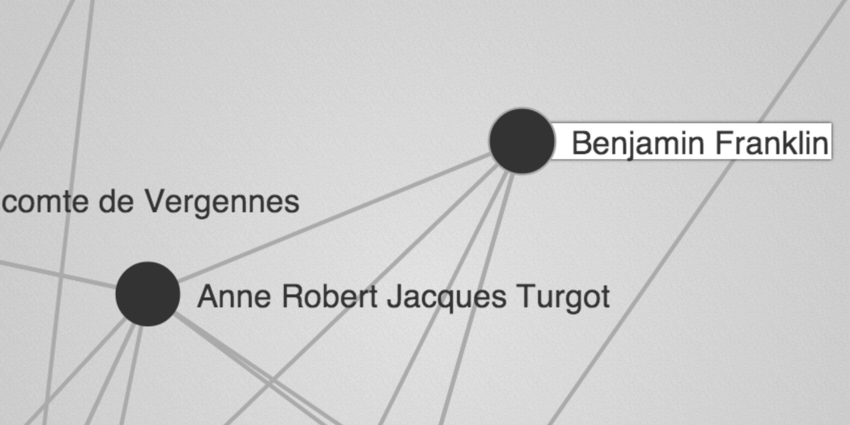
A network exploration tool that brings into play both explicit connections (through correspondence, for example) and possible networks based on collocation and affiliation.
Demo
Ink

Ink

2012
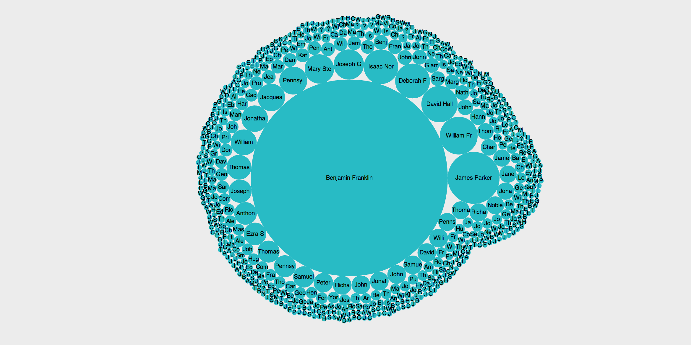
A combination of map, histogram, and flow (alluvial diagram) view highlights the relations between different dimensions of data.
Demo--> Code

Inquiry

Inquiry

2012
A tool that emphasizes research questions as a starting point for visualizing data; generating layered maps based on complex queries.
Fineo

Fineo

2011
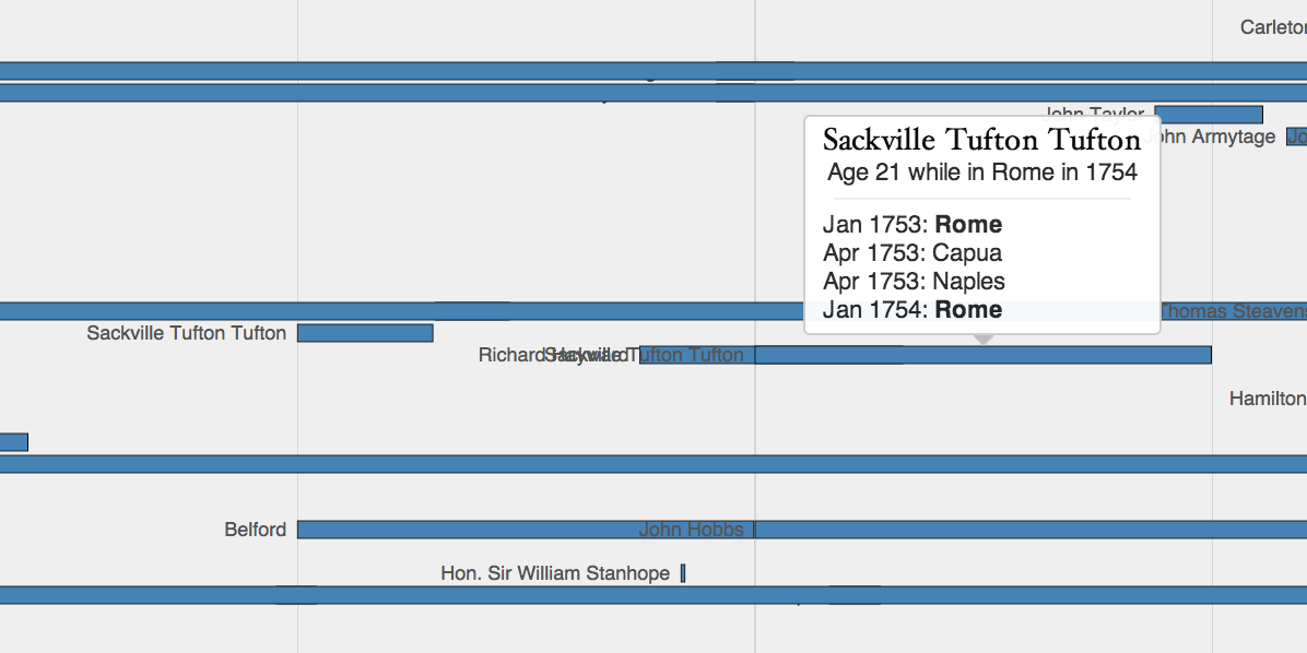
Inspired by the visual model of Sankey diagrams, Fineo allows users to explore how data is distributed between different dimensions. Created by DensityDesign Research Lab, Politecnico di Milano.
Demo App

Priestley Timechart

Priestley Timechart

2011
Inspired by Joseph Priestley's 'A Chart of Biography' (1763), this chart displays the length of stay of visitors by city on a brushable timeline allowing scholars to see who was in the same city at the same time.
Corrispondenza

Corrispondenza

2010
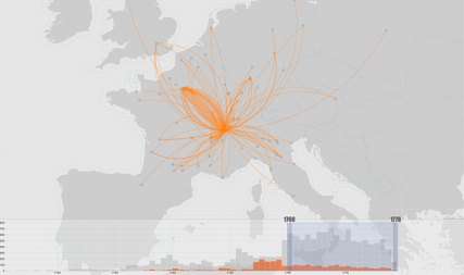
This point to point map visualization was developed to show 'missing' data. It was the first in a series of experiments in visualizing uncertainty and complexity in data.
RPLVIZ

RPLVIZ

2009
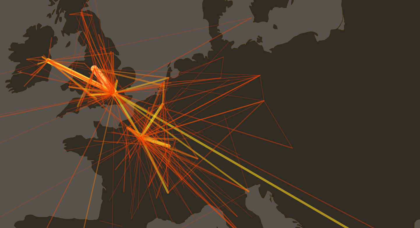
The first visualization experiment for Mapping the Republic of Letters. Built by Jeff Heer's students in CS448b.
Demo