Create a Map
We’ll start with point data.
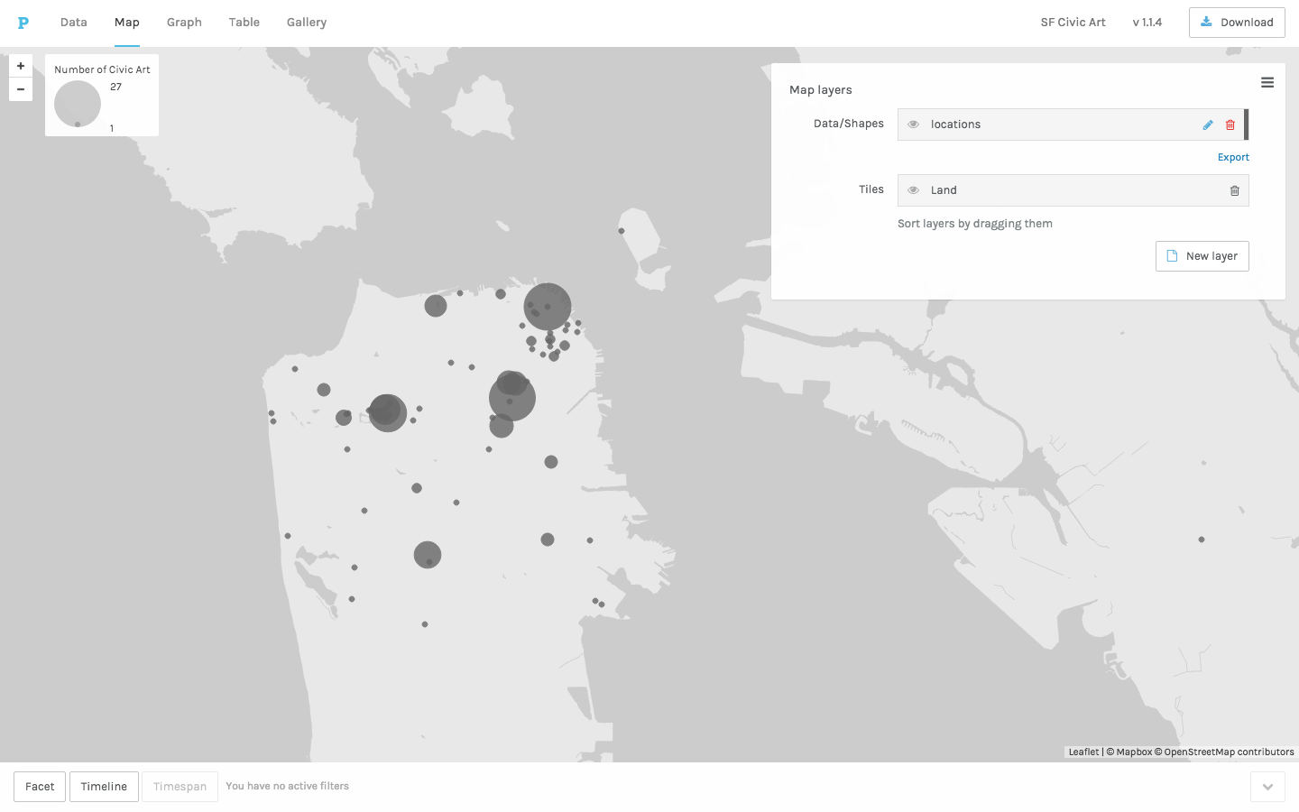
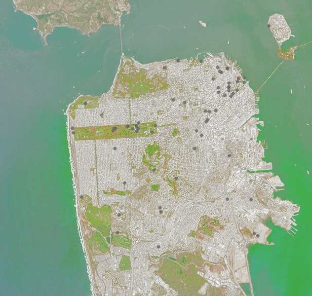
The data will show up on your map like this.
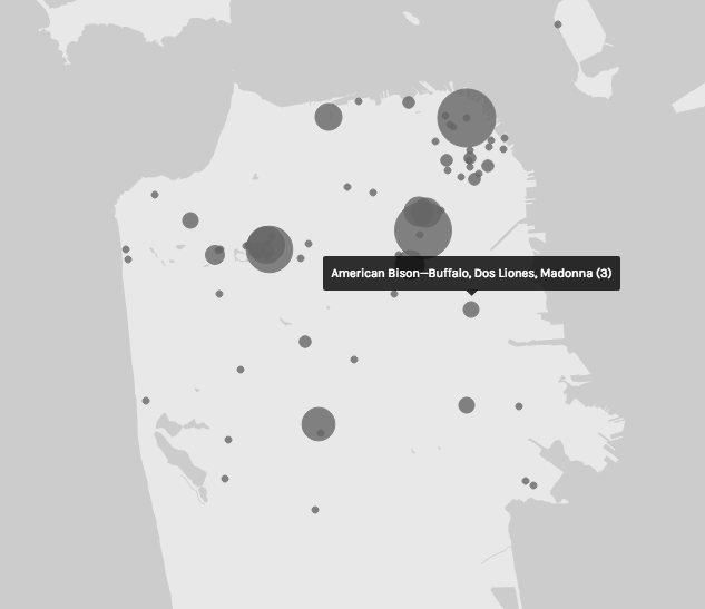
You can see specific data points by hovering.
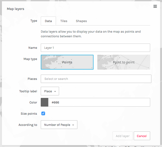
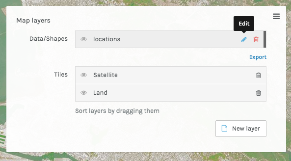
Edit your data layers by clicking on the edit button.
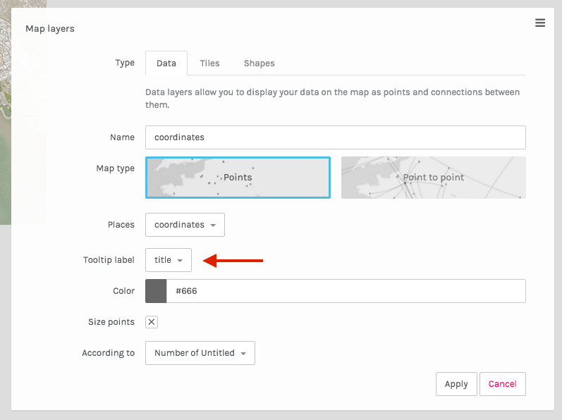
You can specify which dimension is used to label the points (tooltip).
When we first plotted the points, they were sized by items per location. If we uncheck that option, we can focus our attention on the unique locations.
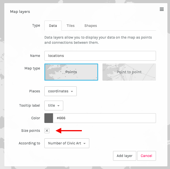
Unsized data looks like this.
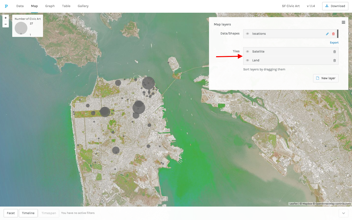
There are a number of basemap layers to choose from.
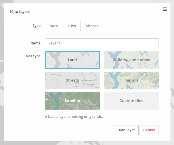
We’ve added satellite imagery as a tile layer.
Investigate multiple dimensions of the data using interactive filters like the Timeline shown below.
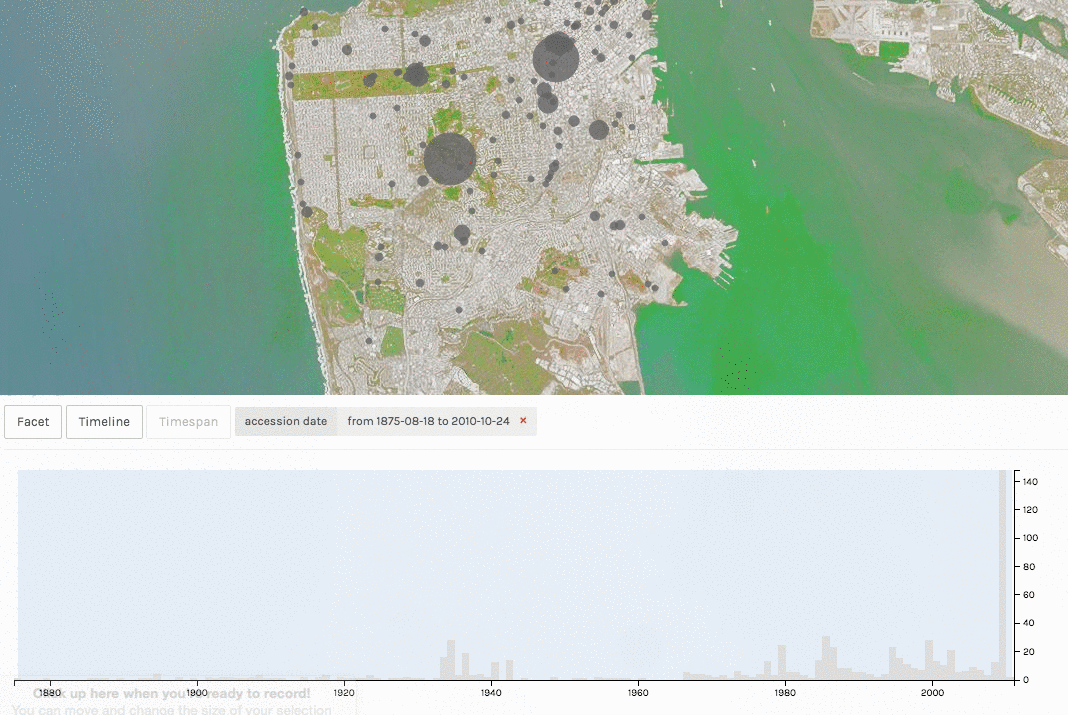
##To learn more about using the Timeline, Timespan, and Facet Filters, see our separate tutorials.
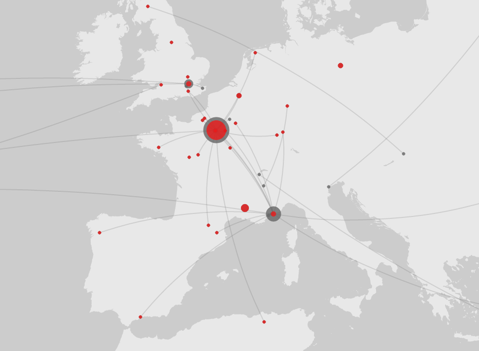
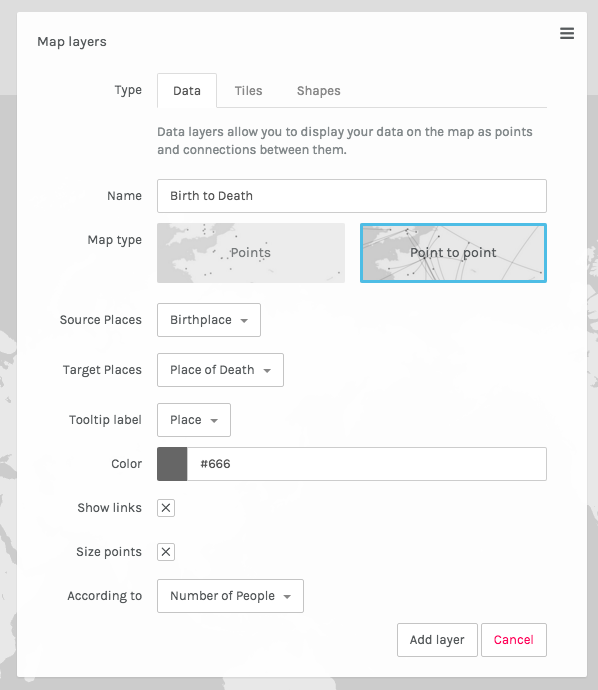
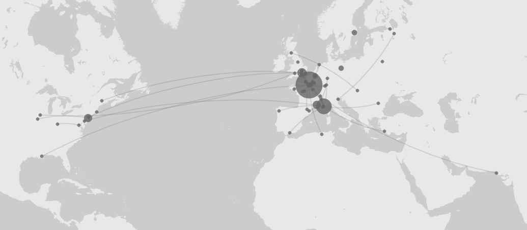
Another mapping option is Point to Point, which requires two sets of place data (birthplaces and deathplaces in this example).
Here you can see the paths between birthplace (source) and death place (target). The clockwise arc of the line indicates the direction of the relationship.
You can add multiple data layers and choose the color.
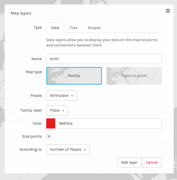
In this map, we’ve assigned red to birthplaces to more easily distinguish them from death places.
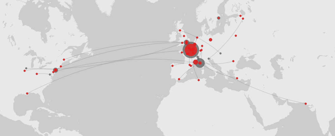
With this view, you can more easily follow the arc between birthplace and death place.