Food Culture, Palladio, and Representing Magnitude / Molly Taylor-Poleskey
Molly Taylor-Poleskey writes:
PROJECT OVERVIEW
My research questions take advantage of a large base of manuscript sources detailing the yearly consumption of one of the palaces of Prince-Elector Friedrich Wilhelm of Brandenburg-Prussia. In my dissertation, I argue that the elector’s cultural agenda helped transform his territories over the course of his reign from dilapidated and war torn to stable and powerful (primed for ascension to royalty under Friedrich Wilhelm’s son).
RESEARCH QUESTIONS
To support this argument, I’m looking for change in taste over time or other patterns in consumption that reveal the court’s aesthetic values and cultural ambitions. This means creating visualizations that show what proportions of different foods or food groups were consumed. For example, was there a shocking dearth of wheat compared to rye? When consumption of one commodity dwindled, what other foods were substituted (and vice versa)?
My second research question looks at this consumption data in conjunction with information about the percentage of the year that the elector was at the palace in Königsberg. This will help me understand the functioning of the palace and make some inferences about daily consumption amounts. This might eventually lead to seeing seasonality of the foods consumed (this depends on the normalized bar charts discussed below).
ISSUES
The two biggest challenges [History Department Academic Technology Specialist] Jason Heppler and I have faced while creating visualizations of this data are, 1) accounting for the years for which we have no data and, 2) reconciling the various units of measure to compare different foods.
ATTEMPTS
Jason has already put together a ribbon graph representation of one of the food groups from my data (grains) to see relative use of ingredients. While this exposed that peas were typically consumed in much greater numbers than other grains, this visualization masked the exact yearly values and smoothed out the years with no data.
We also attempted to understand the shape of our data by making simple bar graphs of each food group and, with yet further detail, individual ingredients. This provided a quick snapshot and alerted us to years that spiked in consumption. But, the scale of measurement was so different for each food, it was not feasible to compare across units of measure. Some years of extraordinary consumption throw of the scale so that years of typical or little consumption are imperceptible.
Now Jason is working on displaying the data in normalized bar charts of units of variety. This step will help me gain an overall understanding of the contents of the data collected. From this step of appreciating the qualitative aspects of the data as such, we can return to the original quantitative questions with a better eye for changes in consumption.
THOUGHTS FOR A PALLADIO COMPONENT
In order for Palladio to be useful in solving our research challenges, it needs another display feature that shows flows of data and can be sensitive to the different scales of measurement.
Molly and Jason produced visualizations, including the two below, (not in Palladio). Image descriptions by Jason Heppler.
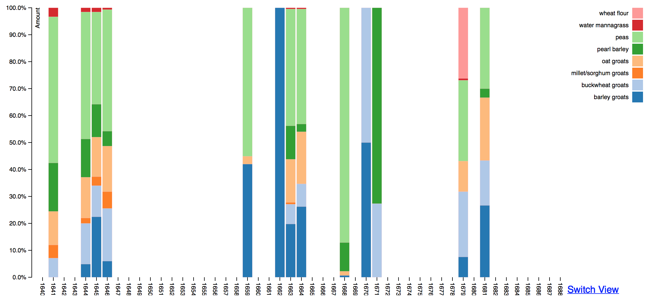
Figure 1.
Since some food items are counted by different units of measure over time, we work around the problem of different scales by plotting the amount of food items in relation to all other food items in a single year and totaling the items by percentage rather than absolute amounts.
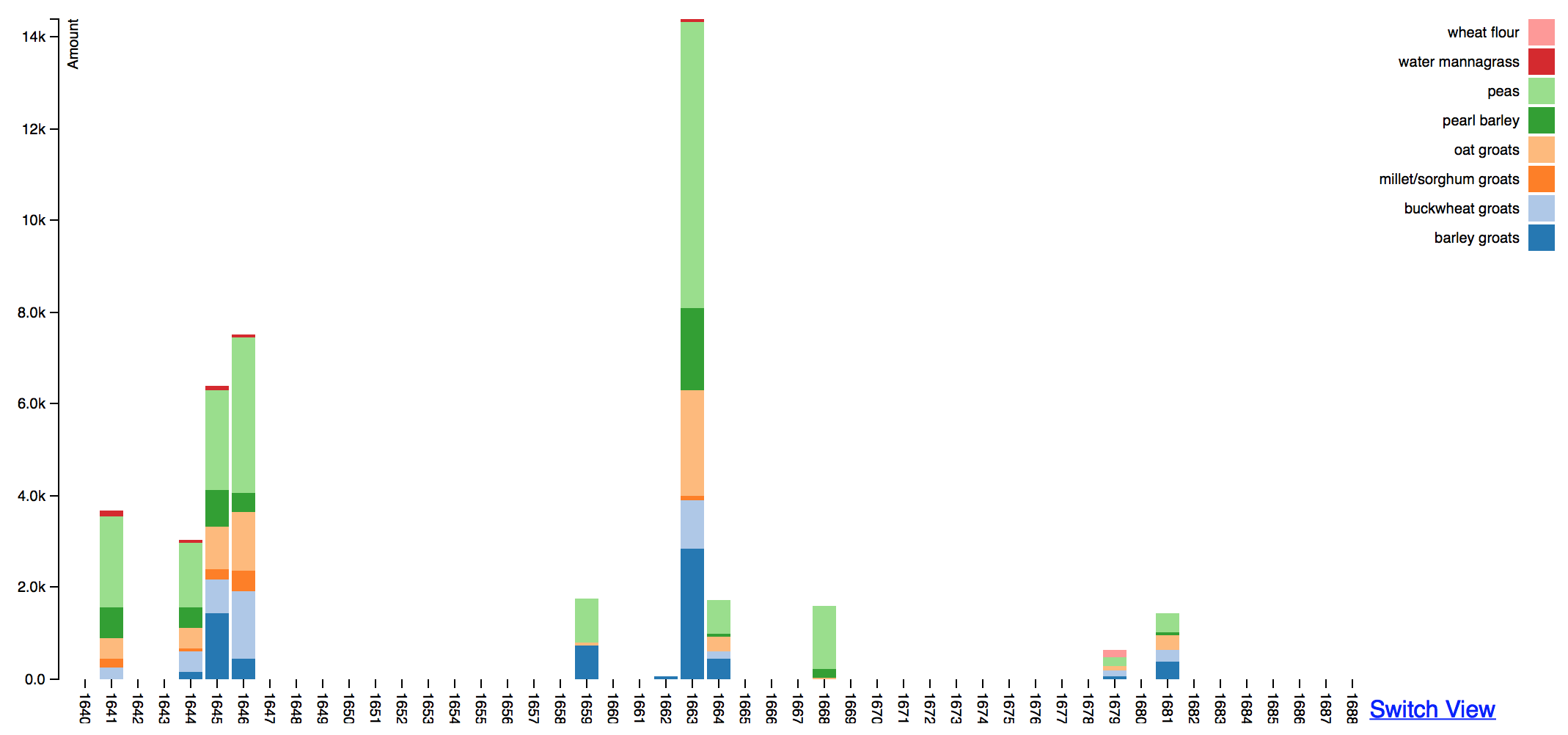
Figure 2.
We can view the absolute amounts of food items for each year, but we begin to run into problems with other food types because the units of measure sometimes changed year to year. Here, grains all contain the same unit of measure over time.
Mark Braude responds:
Following conversations with Molly and Jason, we are working toward creating visualizations in Palladio that privilege the display of relative magnitude, and that are especially sensitive to working in different registers and scales, to help her drive home her arguments about the variety of consumption patterns in the society she studies. As some of the years in the sources Molly studies have incomplete or missing data, her use case has also aided us in thinking about how best to work with incomplete data in ways that are not misleading or overly simplistic.