Palladio Testimonial / Christoph Kudella
My name is Christoph Kudella and I am a Digital Arts and Humanities PhD candidate in University College Cork. My doctoral research is on correspondence networks in the Renaissance and I also teach tools and methods in Digital History at the University of Göttingen. Within this context I conducted a seminar on data collection, analysis and visualization for undergraduate history students. While hosting the 50th annual convention of German historians (Deutscher Historikertag) in Göttingen this year we were prompted to inquire into earlier gatherings of this kind. We chose four of the five annual ‚Historikertage’ during the Weimar Republic, a very decisive period in German historiography framed by the end of World War I at one end and the NS-period at the other.
The main source for our inquiry were printed reports of these gatherings that included lists of attendees. These provided us with their names, professions and place of residence. We took these information particles as the point of departure to build a spreadsheet that detailed the c. 1.700 persons that were in attendence. The students were tasked with collecting prosopographic information on each of the attendees (where available). This task included the identification of each person in the Virtual International Authority File (VIAF) as well as the collection of biographical snippets derived from the World Biographical Information System (WBIS). In this fashion, data has been collected on the individuals date and place of birth and death, their place of study, their doctoral supervisors (where applicable), institutional affiliations, gender and so forth. In a second spreadsheet each location was assigned an individual entry, including geocoordinates, in which modern county and country it is situated as well as the appendant ID in Geonames.
From this baseline we began undertaking analyses on our dataset. Palladio provided us with a powerful way to filter, navigate and visualize our data without any cumbersome intermediate steps, such as data preparation, and without the usage of additional software packages. Once we had linked the ‘location’ column in the master spreadsheet to the corresponding column in our ‘locations’ spreadsheet via Palladio, we were ready to visualize the geospatial aspects of and network connections in our data.
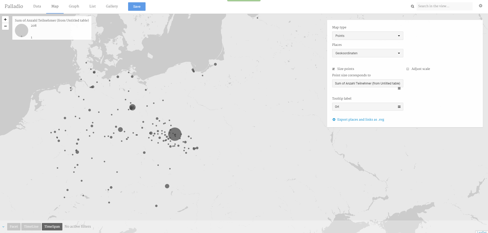 Figure 1
Figure 1 shows an example of one of our points of inquiry, that is the ‘zone of attraction’ of the individual convetions. It became immediately apperent that these gatherings were to a large part a local affair that mostly attracted people in the vicinity. This partially contradicts earlier research findings on the topic.
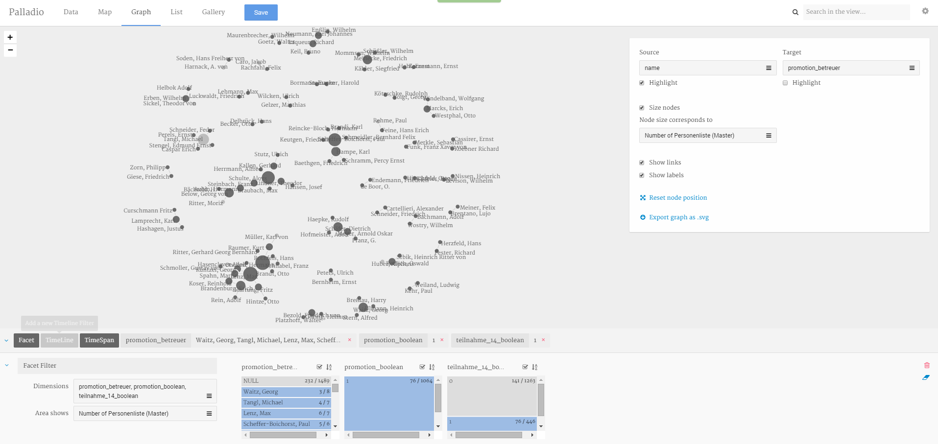 Figure 2
Figure 2 shows the links between attendees and their doctoral supervisors, thus giving us insight into a highly interconnected academic community that met during this conventions.
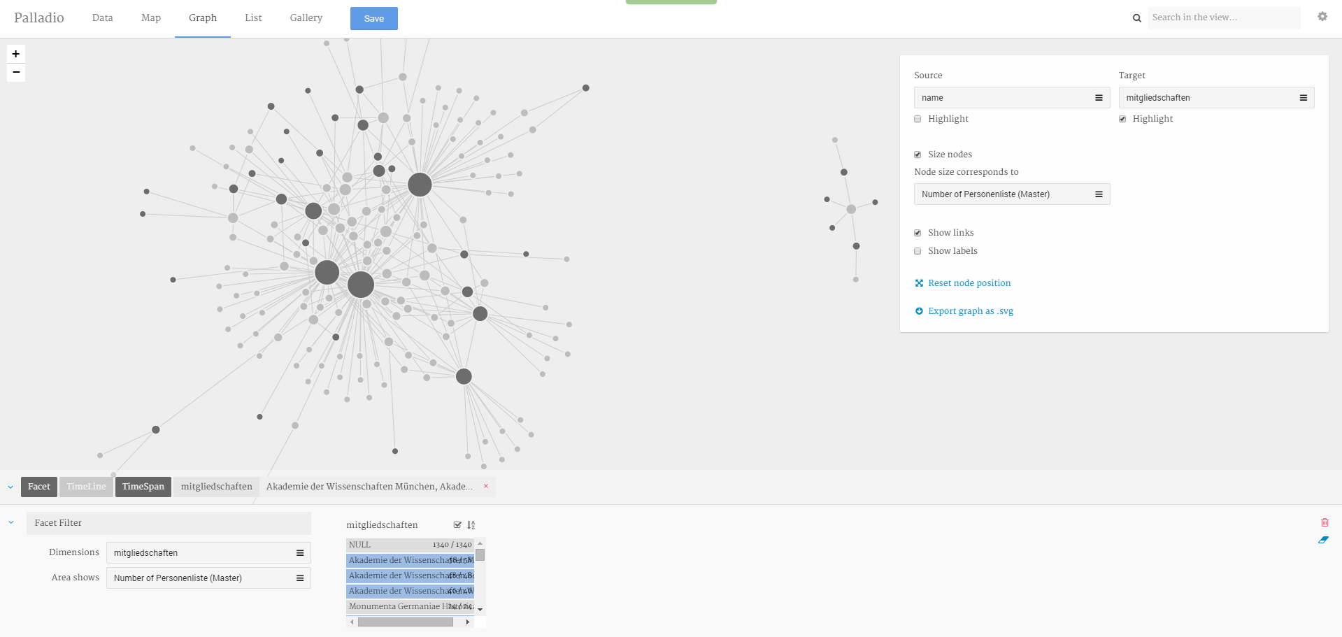 Figure 3
Figure 3 shows the links between attendees and the scientific academies spread over Western Europe, again enabling us to survey academic networks based on empirical data.
In conclusion, Palladio has been an invaluable tool for our project. It has permitted us to test hyptheses in a quick and easy fashion. While it will never replace specialized, dedicated software platforms for specific purposes, such as GIS or Social Network Analysis, it can provide invaluable pointers to aspects of your data that demand closer attention without losing valuable time converting data, switching in between programs and other monotonous taska that take up valuable research time.